Add this component

npx zentauri-ui add product-3d

Accessibility notes

Keyboard accessible by default with semantic markup, visible focus treatment, and tokenized states. Add descriptive labels for icon-only or decorative usage.

Dependency notes

Check Installation for shared peers. This component keeps styling in Tailwind classes and the --zui-* token contract.

Media

3D Product Showcase for every angle

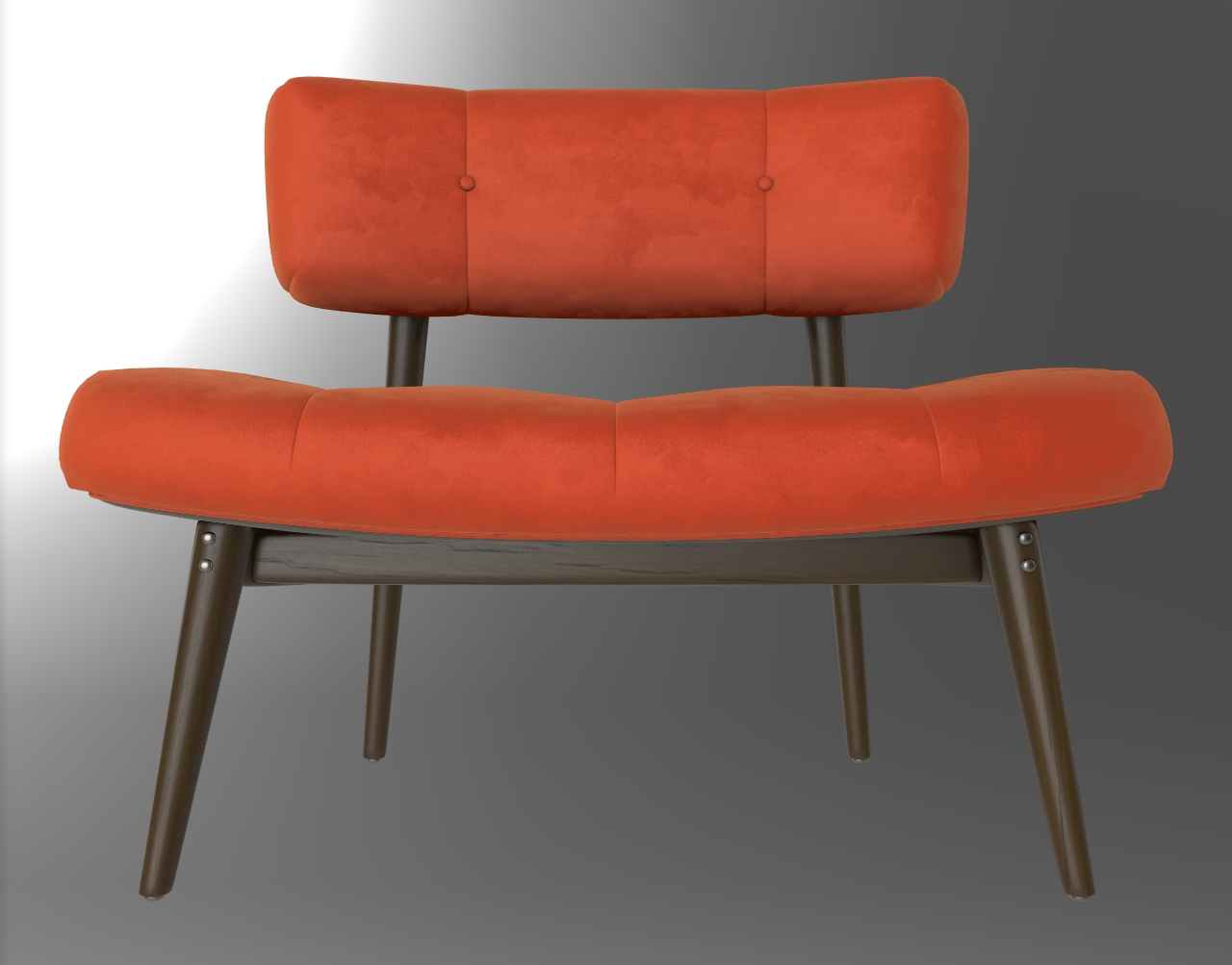
Give customers and visitors a closer look at a product. Load a GLB or glTF model, orbit and zoom around it, annotate details, and carry a poster image through loading or failure states.

Loading 3D model · 0%

Product showcase playground

Orbit the chair, zoom into the materials, open a hotspot, or expand the viewer to fullscreen.

GLB model and interactive annotations


Loading 3D model · 0%

Install the optional renderer peers when using this entry: pnpm add @google/model-viewer three. Studio, soft, and neutral use the renderer’s built-in lighting; pass environmentImage to light the model with your own HDR or equirectangular map.

All appearances

Select a poster card to apply its accent to the live viewer.

default
primary
secondary
success
destructive
warning
info
blue
cyan
emerald
violet
rose
amber
slate
gradient-blue
gradient-emerald
gradient-rose
glass

Product 3d API

Generated from the package prop types and variant definitions.

Product3D

Product3DProps

Variants

PropTypeDefault
appearance
amberbluecyandefaultdestructiveemeraldglassgradient-bluegradient-emeraldgradient-roseinfoprimary+6
default
size
lgmdsm
md

Behavior

PropTypeDefault
altstring | undefinednone
autoRotateboolean | undefinednone
cameraControlsboolean | undefinednone
cameraOrbitstring | undefinednone
defaultSelectedHotspotIdstring | null | undefinednone
environmentProduct3DEnvironment | undefinednone
environmentImageCustom HDR, UltraHDR, or equirectangular image URL; overrides the preset map.string | undefinednone
exposurenumber | undefinednone
fallbackReactNodenone
hotspotsreadonly Product3DHotspot[] | undefinednone
loadingContentReactNodenone
modelURL for a self-contained GLB or a glTF file with reachable resources.string | undefinednone
onError(() => void) | undefinednone
onFullscreenChange((fullscreen: boolean) => void) | undefinednone
onHotspotSelect((id: string | null) => void) | undefinednone
onLoad(() => void) | undefinednone
onProgress((progress: number) => void) | undefinednone
posterstring | undefinednone
selectedHotspotIdstring | null | undefinednone
shadowIntensitynumber | undefinednone
shadowSoftnessnumber | undefinednone
showControlsboolean | undefinednone
showFullscreenboolean | undefinednone
skyboxImagestring | undefinednone
zoomboolean | undefinednone

Content

PropTypeDefault
childrenReactNodenone
Inherited HTML props
PropTypeDefault
classNamestring | undefinednone
idstring | undefinednone
onClickMouseEventHandler<HTMLDivElement> | undefinednone
styleCSSProperties | undefinednone
titlestring | undefinednone

Product3DVariant

Product3DVariantProps

Behavior

PropTypeDefault
appearance'default' | 'blue' | 'cyan' | 'slate' | 'rose' | 'emerald' | 'gradient-blue' | 'violet' | 'amber' | 'glass' | 'success' | 'warning' | 'info' | 'secondary' | 'destructive' | 'primary' | 'gradient-rose' | 'gradient-emerald' | null | undefinednone
size'md' | 'sm' | 'lg' | null | undefinednone
CSS variable overrides

Product 3D CSS variables

Theme the viewer surface, controls, hotspot accents, annotations, and status messages.

78 variables

Pattern: --zui-<component>-<slot?>-<variant?>-<property>-<state?>-dark?

:root {
  --zui-product-3d-amber-accent: #d97706;
  --zui-product-3d-annotation-bg: #fff;
  --zui-product-3d-annotation-border: #cbd5e1;
  --zui-product-3d-annotation-fg: #0f172a;
  --zui-product-3d-bg: #f8fafc;
  --zui-product-3d-blue-accent: #2563eb;
  --zui-product-3d-border: #cbd5e1;
  --zui-product-3d-control-bg: #fff;
  --zui-product-3d-control-border: #cbd5e1;
  --zui-product-3d-control-fg: #334155;
  --zui-product-3d-control-hover: #f1f5f9;
  --zui-product-3d-cyan-accent: #0891b2;
  --zui-product-3d-default-accent: #6366f1;
  --zui-product-3d-destructive-accent: #dc2626;
  --zui-product-3d-emerald-accent: #059669;
  --zui-product-3d-fg: #0f172a;
  --zui-product-3d-fallback-bg: rgba(0,0,0,0.5);
  --zui-product-3d-fallback-fg: #fff;
  --zui-product-3d-glass-accent: #64748b;
  --zui-product-3d-gradient-blue-accent: #3b82f6;
  --zui-product-3d-gradient-emerald-accent: #10b981;
  --zui-product-3d-gradient-rose-accent: #f43f5e;
  --zui-product-3d-hotspot-border: #fff;
  --zui-product-3d-hotspot-dot: #fff;
  --zui-product-3d-hotspot-fg: #fff;
  --zui-product-3d-hotspot-focus: #fff;
  --zui-product-3d-hotspot-shadow: rgba(0,0,0,0.3);
  --zui-product-3d-info-accent: #0284c7;
  --zui-product-3d-primary-accent: #2563eb;
  --zui-product-3d-rose-accent: #e11d48;
  --zui-product-3d-secondary-accent: #64748b;
  --zui-product-3d-slate-accent: #475569;
  --zui-product-3d-status-bg: #fff;
  --zui-product-3d-status-border: #cbd5e1;
  --zui-product-3d-status-fg: #334155;
  --zui-product-3d-success-accent: #16a34a;
  --zui-product-3d-violet-accent: #7c3aed;
  --zui-product-3d-warning-accent: #d97706;
}

/* Dark theme variables follow the same names with -dark appended. */
.dark {
  --zui-product-3d-amber-accent-dark: #fbbf24;
  --zui-product-3d-annotation-bg-dark: #0f172a;
  /* ...same variables with -dark at the end */
}

What it does

Product 3D wraps the model-viewer web component in a tokenized React surface. It exposes orbit controls, zoom, auto rotation, fullscreen, and loading callbacks.

Models, posters, and loading

Pass a GLB or glTF URL with a descriptive alt label. A poster remains visible while the model loads, and fallback content appears if loading fails. Progress is available through onProgress.

Lighting and environments

Choose studio, soft, dramatic, neutral, or legacy lighting. Studio, soft, and neutral use built-in lighting with distinct exposure and shadow settings; environmentImage overrides the built-in environment with your own map.

Hotspots and camera controls

Position hotspots in model coordinates and attach short annotations. Hotspots are buttons, support controlled selection, and remain readable as the camera moves. Native orbit gestures work alongside reset, zoom, and fullscreen controls.

Common use cases

  • E-commerce product detail pages and configurators.
  • SaaS hardware and device landing pages.
  • Portfolio case studies and interactive exhibits.
  • Automotive and furniture presentations.

Accessibility and integration

Provide meaningful alt text and hotspot labels. Loading progress and fallback content are announced. The client entry loads the optional renderer in an effect, keeping server rendering safe in Next.js App Router.

FAQ

Which 3D formats are supported?

The renderer supports GLB and glTF. A GLB is self-contained; a glTF may reference separate textures and buffers that must remain reachable.

How do I use a custom environment map?

Pass environmentImage as the URL of an HDR, UltraHDR, or equirectangular image. Optional skyboxImage displays an environment in the background as well.

What dependencies are needed?

Install @google/model-viewer and its matching three peer dependency alongside the Zentauri component package. The 3D renderer is loaded only when this viewer mounts in the browser.